Conversion rate optimisation (CRO) is a technical and creative process with the aim of increasing the number of users who take a desired action on your website. This can be done by analysing website visitors and identifying the reasons for their behaviour, then implementing changes to increase the number of conversions – this might be form submissions, product purchases, account registrations or any other action you want the user to take.
The following points are the key steps in CRO:
- Identify goals for conversion
- Identify potential barriers to conversion
- Analyse visitor behaviour on website
- Make changes to website based on findings
What are the Best Practices for Conversion Rate optimisation?
A good CRO strategy starts with understanding your conversion funnel and where you can optimise it. To do this, you need to know what your visitors are doing on your site before they convert. This is called a “funnel report.”
There are many different ways to optimise a conversion funnel:
- A/B testing
- Split testing
- Landing page optimisation
- Content optimisation
How to Increase Conversions with a Landing Page Design?
A well-designed landing page can increase conversions. Landing pages are the first point of contact for your site visitors, so it is important that you create a good first impression.
Think about the questions or problems that your visitors have and then create a landing page to answer them. Visitors will be more likely to convert if they feel like you understand their needs and are able to offer them what they want.
The goal of a good landing page design is to make it as easy as possible for visitors to make a purchase or take an action that you want them to take. A good landing page design is clear and concise, provides value in exchange for an email address or other contact information, has high-quality graphics and text, and is responsive to different devices.
No matter what type of marketing you are running for your business, you need to ensure you have a fully optimised landing page to get the most out of your marketing. Whether it’s social media, email, GoogleAds or SEO marketing, each platform will drive a specific type of targeted audience to your website, each requiring their own specific optimisations for a landing page.
How to Increase Conversions with a Call-to-Action Button?
A call-to-action button is a link or button on a website that urges the visitor to take an immediate action.
There are two types of CTAs:
- Primary Call-to-Action (PCTA) – the main call to action that you want your visitors to take.
- Secondary Call-to-Action (SCTA) – a secondary action which is less crucial and may not be directly related to your business.
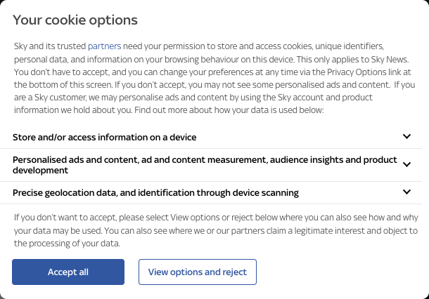
An example of a primary and secondary CTA can be a cookie banner with an “Accept” button and a “Reject” button. In this example, Accept would be the primary CTA and Reject would be the secondary CTA. You’ve probably seen this exact scenario while browsing the web, and you should be able to recall how noticeable the Accept button is compared to the Reject button, sometimes Reject isn’t even a button, it could just be a small bit of text.
Here’s an example from the Sky News website, where the Primary CTA to accept all cookies is a lot more noticeable than the Secondary CTA to reject these cookies:

In order for CTAs to work, they need to be designed properly, for example, by placing them in the right location on the page and making sure that they stand out from other elements on the page.
Having the right call to action is the key to driving conversions. After all, no one will convert if they can’t find your form or button. When designing your CTA, it’s important to keep a few things in mind: Placement and appearance are key, so make sure that you are using contrasting colours and putting them in a prominent spot on the page. Although we all know the importance of sticking to brand guidelines, sometimes using a unique colour for your most important CTA can do wonders for your conversion rate.
Conclusion: The Importance of Conversion Rate optimisation in Marketing
In conclusion, conversion rate optimisation is an important part of marketing. It is a process that looks at the entire customer journey and seeks to increase the number of conversions. Whether your business deals with lead generation or direct sales, a higher number of conversions will always mean good results for your business.
Many, if not all, aspects of conversion rate optimisation require the assistance of a professional web developer. Whether you have a current website in need of optimisation or require a full rebuild from the ground up, our team of local experts at WebDeveloperLondon.com have a bespoke web design solution for you. Increase your sales and conversions today: contact us for a free quote on our web development services!


